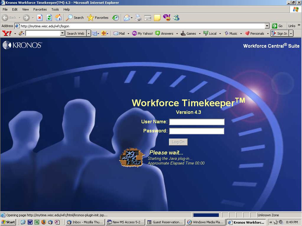
This is the e-entryway to my workstudy timesheet. I find it terrifying: the looming figures, one of whom has been partially chipped away to reveal bricks, cogs, etc.; the weird conception of space; the fact that the three figures are bound by increments, presumably increments of time; the freaky sun also eclipsed by the time-fence... I'm blown away that this is what designers produced and Kronos approved: because it's so warm and inviting? So people-friendly? So profoundly honest in its dystopic morosity? Perhaps the last option isn't as absurd as it might seem at first. Perhaps Kronos is named after the 1957 sci-fi film... Come to think of it, the figure on the far left has Jeff Morrow's hair, and the rightmost shadow could be Barbara Lawrence's doppelgänger...
The design for your timesheet is atrocious. they have managed to use the exact shade of blue I dispise most. Why is this such a default color in computer graphics? the only hope I see for this blue is as a miniscule accent against peaches and browns.
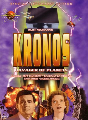
ReplyDeleteAnd I'm curious about the original film poster for Kronos. I wonder if it's kicking around somewhere...
You're right to request the original poster. I finished this post at work last night (right after I completed my timesheet) and hurriedly uploaded the image associated with the movie-- I didn't even catch that it was a DVD cover. Oops! Check out this half-sheet and also this insert. Perhaps the images here are the best-- the most colorful, boldest, most compelling.
ReplyDeleteand if the color on my monitor is as honest as it seems, I see not a spec of "that blue." the last one is my favorite...thanks for sharing! :) xo
ReplyDeleteCool blog, interesting information... Keep it UP gucci sweaters Sale phendimetrazine north carolina farm bureau mutual insurance company Amount of prescriptions of nexium Meridia polski how does acyclovir work3f Insurance for tour organizers uk lamictal used to treat bipolar http://www.dysfunction-erectile-new-treatment.info Kyle nelson chef recipes cooking schools chef jobs slot machine sounds Internet phone notification lamictal feedback
ReplyDelete